
Advance excel interview questions and answers to boost your career and increase your earning potential
Advance Excel is an essential tool in today’s business world and is widely used in various industries, including finance, marketing, and operations. It allows users to organize, analyze, and manipulate large amounts of data quickly and efficiently. As a result, companies are constantly seeking employees with advanced Excel skills to help them make data-driven decisions and improve their bottom line.
If you want to boost your career and increase your earning potential, then it’s time to invest in advanced Excel training online.
Having advanced Excel training can give you a significant advantage in the job market and open up a wide range of career opportunities. Many companies are willing to pay a premium salary for employees with advanced Excel skills, as they recognize the value that these skills bring to their organization.
For example, a financial analyst who can analyze complex data sets and create detailed financial models using Excel is likely to command a higher salary than someone who can only use the basic Excel functions. Similarly, a marketing analyst who can use Excel to analyze customer data and create detailed reports on market trends is likely to be in high demand and command a higher salary.
In addition to higher salaries, advanced Excel skills also make you more marketable and increase your chances of getting a promotion. Companies are always looking for employees who can help them make better business decisions and improve their bottom line, and those with advanced Excel course are well-positioned to do just that.
In conclusion, having advanced Excel training is essential to getting a handsome salary, and it’s an investment that will continue to pay off throughout your career. It can open up a wide range of career opportunities, increase your marketability and help you stand out in the job market. So if you want to boost your career and increase your earning potential, then it’s time to invest in advanced Excel training online.

What is a pivot table and how do you create one in Excel?
A pivot table is a tool that allows you to summarize and analyze large amounts of data by grouping and aggregating the data into meaningful information. To create a pivot table in Excel, you first need to select the data that you want to include in the table, then go to the “Insert” tab and select “PivotTable.”
How would you use the VLOOKUP function in Excel?
The VLOOKUP function is used to look up and retrieve a specific value from a table or range of data in Excel. The function takes four arguments: the value you want to look up, the range of data where the value will be found, the column number within the range that contains the value you want to return, and a logical value (TRUE or FALSE) that indicates whether an approximate match or an exact match should be returned.
How would you use the IF function in Excel?
The IF function in Excel allows you to test a logical statement and return one value if the statement is true and another value if the statement is false. The function takes three arguments: the logical test, the value to return if the test is true, and the value to return if the test is false.
How would you use the SUMIF function in Excel?
The SUMIF function in Excel allows you to sum a range of cells based on specified criteria. The function takes three arguments: the range of cells to sum, the criteria to use to determine which cells to sum, and the range of cells containing the criteria.
How would you use the INDEX and MATCH functions in Excel?
The INDEX and MATCH functions in Excel are often used together to look up a value in a table based on a specified criteria. The MATCH function is used to find the relative position of a value within a range of data, and the INDEX function is used to return a value from a range of data based on a specified position.
Can you explain the process of creating a dashboard in Excel?
The process of creating a dashboard in Excel typically involves collecting and organizing data, creating charts and graphs to display the data, and using layout and formatting tools to make the dashboard visually appealing and easy to understand. Some key steps include:
- Identifying the key metrics and data points that will be included in the dashboard.
- Collecting and organizing the data in a way that can be easily displayed in charts and graphs.
- Creating charts and graphs that effectively communicate the data.
- Using layout and formatting tools to create a cohesive and visually appealing design.
- Adding interactivity and filtering options to allow users to customize the dashboard and explore the data more deeply.
How do you ensure the data displayed in a dashboard is accurate and up-to-date?
To ensure that the data displayed in a dashboard is accurate and up-to-date, there are a few key best practices to follow:
- Use data validation tools to ensure that data is entered correctly and in the correct format.
- Establish a system for regularly updating the data, such as a schedule for pulling in new data from external sources or a process for updating data manually.
- Use data validation and error checking tools to detect and correct any errors in the data.
- Test the dashboard regularly to ensure that all data is being displayed correctly and that there are no errors or inconsistencies.
How do you add interactivity to a dashboard in Excel?
There are several ways to add interactivity to a dashboard in Excel, including:
- Using drop-down menus or filter controls to allow users to select which data to display.
- Creating dynamic charts and graphs that automatically update based on user input.
- Using macros and VBA code to create custom interactivity and functionality.
- Adding hyperlinks to other worksheets or external sources of information for users to explore more deeply.
How do you use formatting and layout tools to create a visually appealing dashboard in Excel?
There are several formatting and layout tools that can be used to create a visually appealing dashboard in Excel, including:
- Using color and font formatting to create a cohesive and visually appealing design.
- Using layout and alignment tools to create a clean and organized layout.
- Using custom shapes and images to add visual interest and branding.
- Using layout and formatting templates to quickly create a polished and professional-looking dashboard.
How do you ensure that a dashboard is easy to understand and use for different audiences?
To ensure that a dashboard is easy to understand and use for different audiences, it is important to:
- Use clear and concise language to label and explain data and charts.
- Use simple and familiar chart types that are easy to understand.
- Use color coding and visual cues to highlight important data and trends.
- Provide clear and detailed documentation and instructions for using the dashboard.

SEO TRAINING COURSE
Sajid AkramAdmin
- 25 Lessons
- Online Class
SEO TRAINING COURSE

Unlock your professional potential with our comprehensive SEO training course. Whether you’re a seasoned marketer or just starting out in the digital world, this course is designed to empower individuals like you with the tools and techniques necessary to enhance your career prospects. Our SEO course goes beyond the basics, providing in-depth knowledge of advanced […]
- Beginner
- 25 Lessons

Digital Marketing Fundamental
Sajid AkramAdmin
- 21 Lessons
- Online Class
Digital Marketing Fundamental
For those seeking new knowledge and career opportunities in online marketing, this class is the ideal starting point. Join now to gain relevant skills and start your journey.
- Beginner
- 21 Lessons
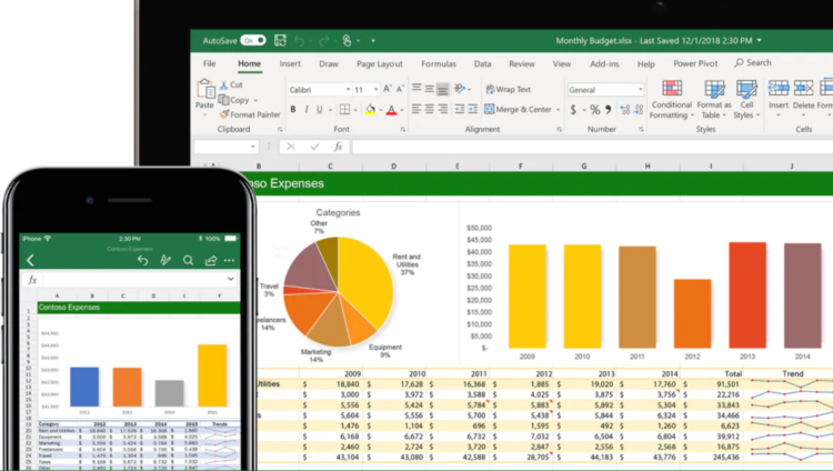
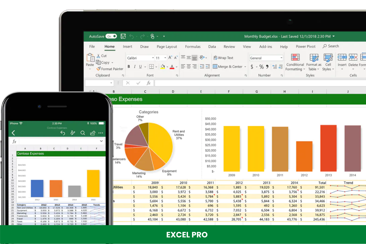
EXCEL PRO
Sajjad HussainSajid Akram
- 71 Lessons
- Online Class
EXCEL PRO

Learn at your own pace and get smarter with our Advanced Excel, Process Automation using Power Query, MIS Dashboard, BI Tools, Highcharts, Data Visualization, Data Analytics and MIS Dashboard Reporting online training program. This master course is designed to teach you the advanced level of Excel formulas, automation, MIS and visualization reporting dashboard all the […]
- All Levels
- 71 Lessons

EXPERT EXCEL
Sajjad Hussain
- 42 Lessons
- Online Class
EXPERT EXCEL
This master course is designed to teach you the advanced level of Excel formulas all the way to Excel mastery. It’s perfect for you if you are a working professional to drastically increase your excel skills to impress your boss, or even get a handsome job. Everything in the course is taught step-by-step in an easy, stress-free […]
- Expert
- 42 Lessons